Rebrand: Sushi To Dai For
Sushi To Dai For is a popular sushi restaurant in San Rafael, CA. Sushi To Dai For's look and feel is exquisite with fresh fish, a unique menu, and a pleasantly affordable atmosphere. You're welcome to sit at a table or the bar as you watch the chefs prepare your delicious sushi.
Sketches
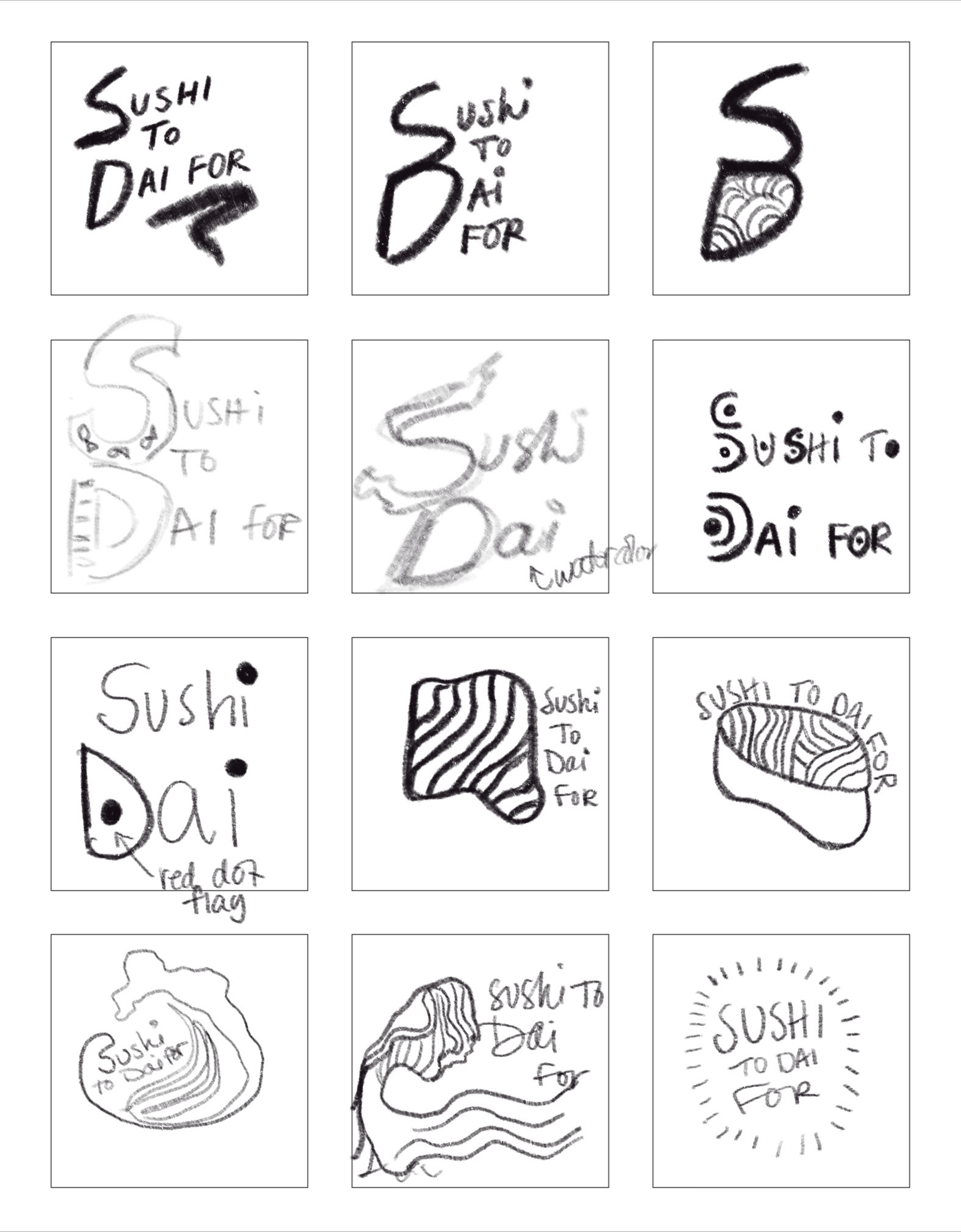
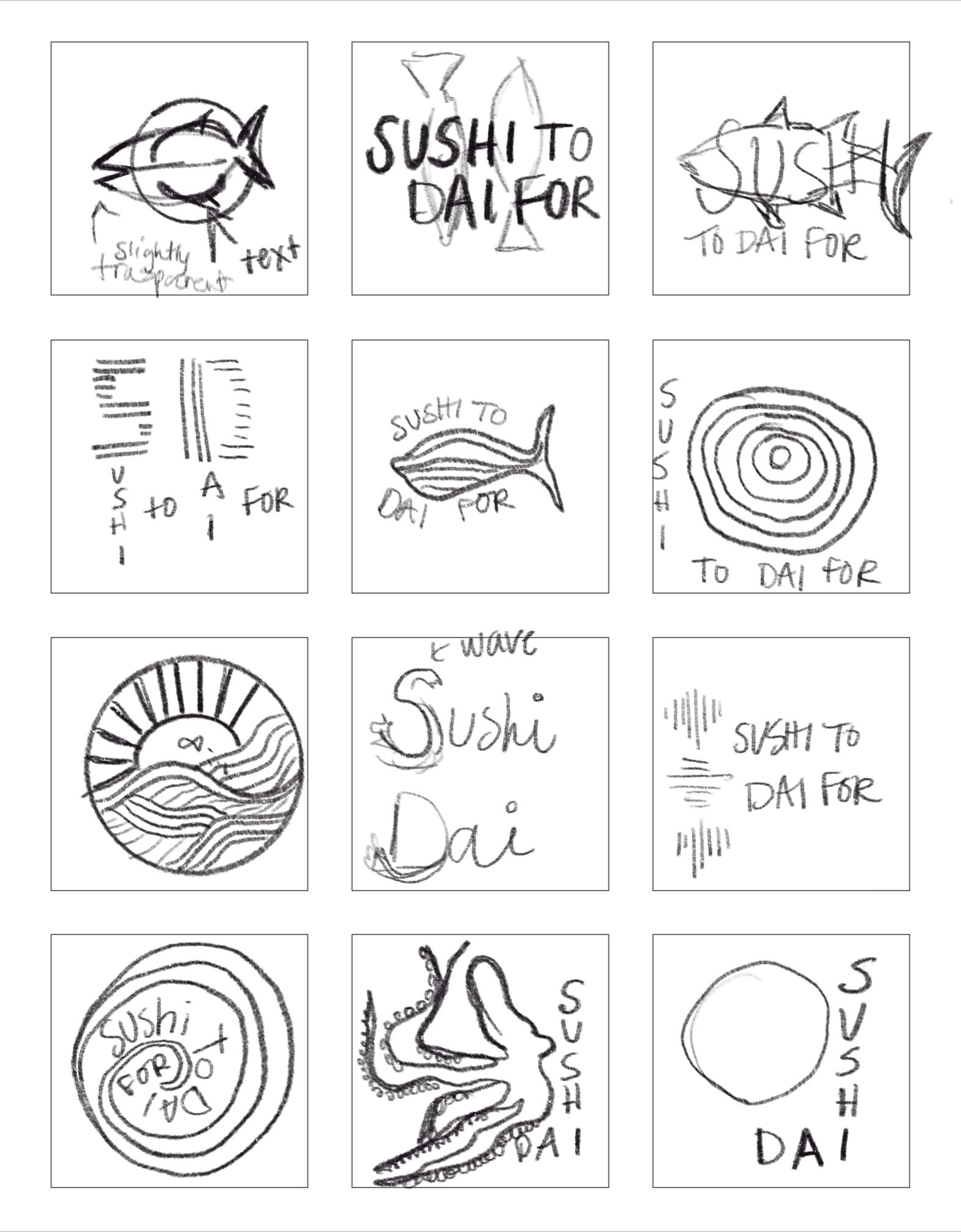
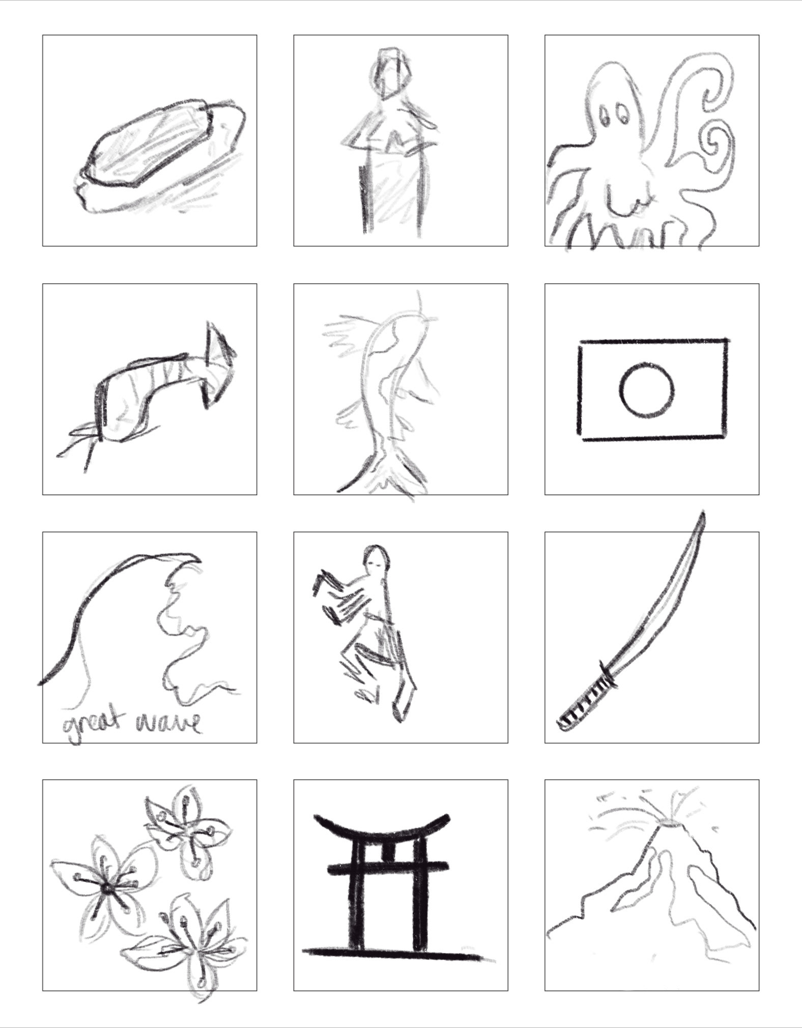
I came up with a list of 30 words that I felt represented STDF best within their existing identity as a restaurant. I sketched these ideas and began experimenting with different shapes, letters, and lines. I wanted to use lines to make curves and illustrate movement.

Iteration Process
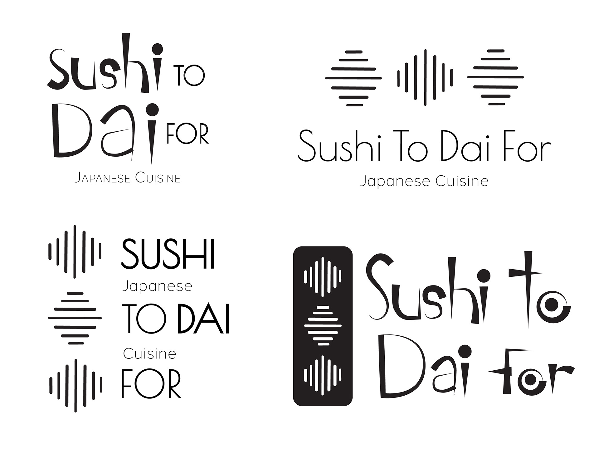
I wanted to create a water element prominent in the restaurant through their beautiful octopus mural. I explored illustrating lines to make curves and illustrate movement. I decided to go off three concepts that I felt incorporated the restaurant the most from my original pencil sketches.
Black & White Versions
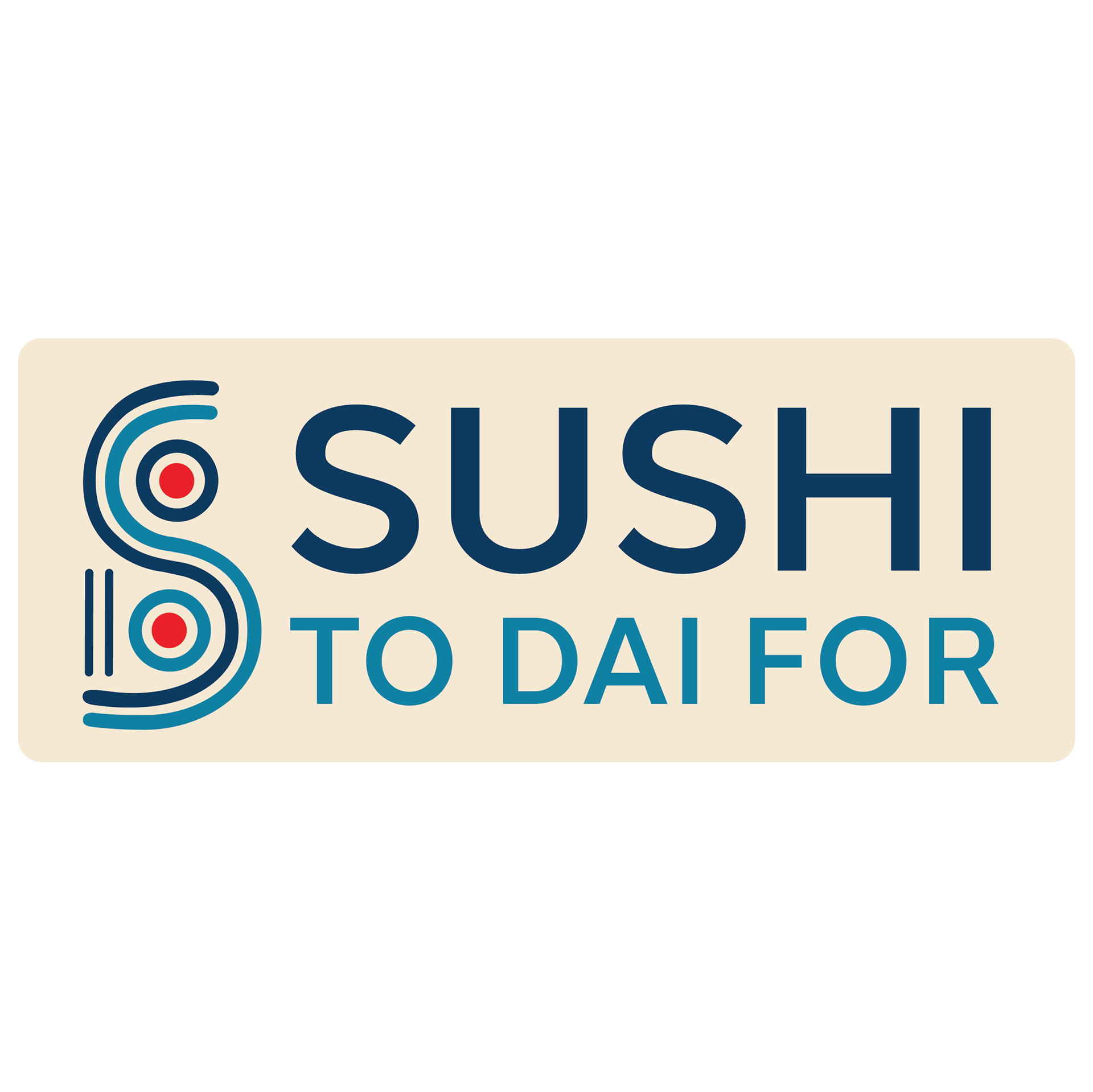
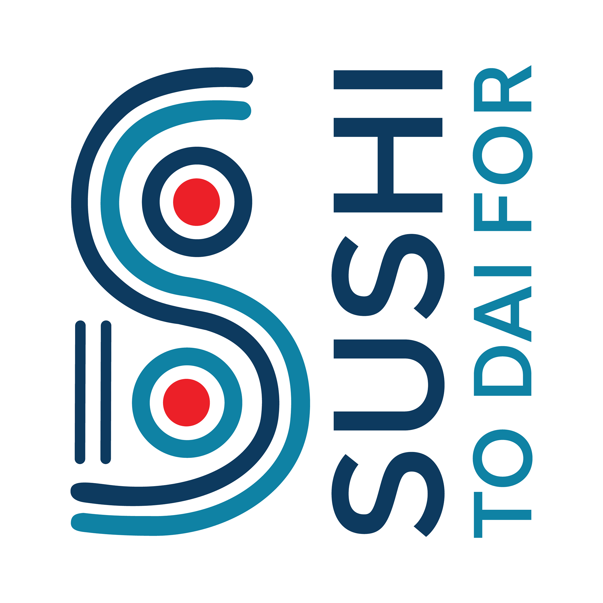
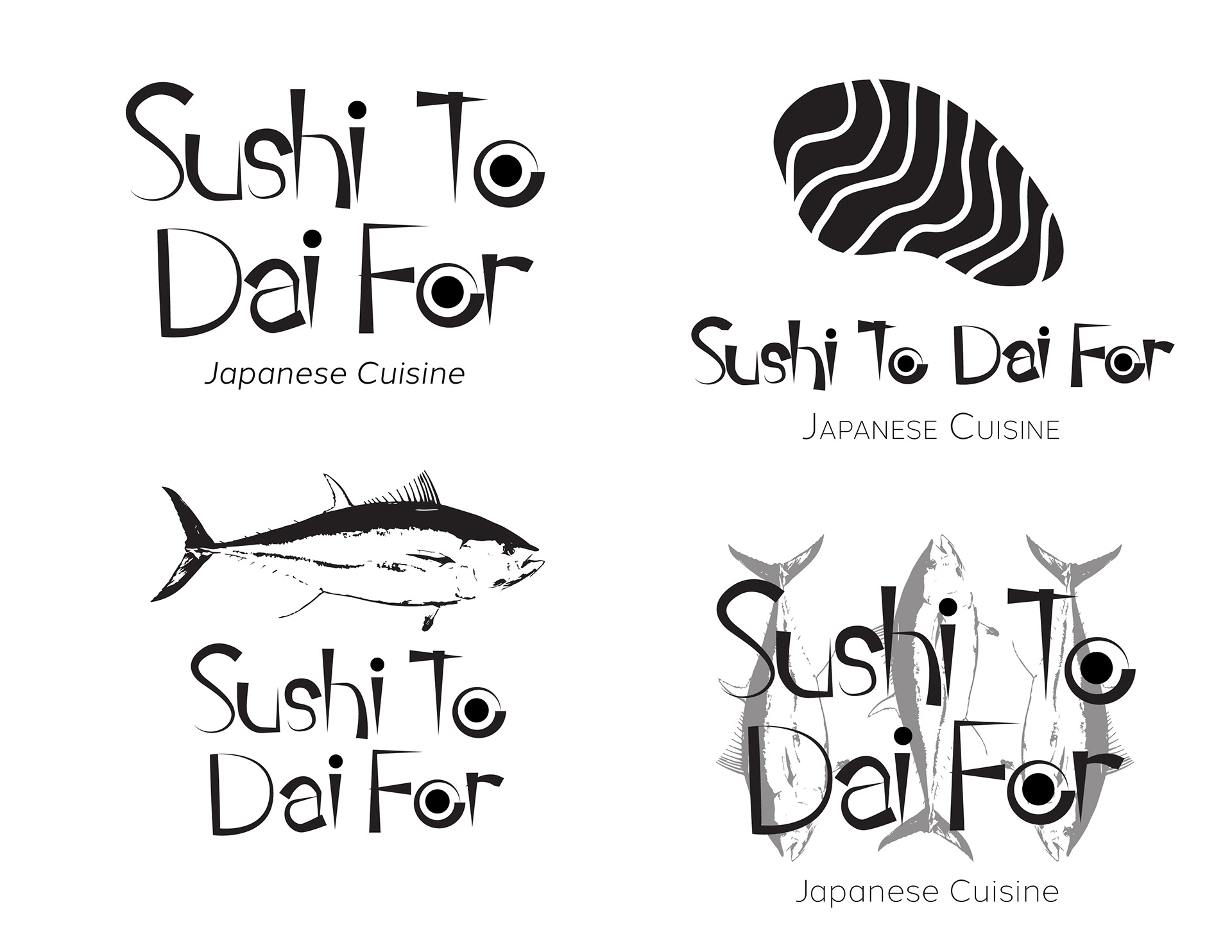
I decided on these versions of the logo. Both the “S” in sushi and “D” in dai are the main letter elements in the restaurant name, so I decided to unify them as one. I added two dots to fill the negative space and play off the pun of “dai” as it represents a target. The dot also represents the Japanese flag as the owner's culture is important to the art form of sushi making.

Typographic Details
I chose Halcom Medium for the type in the logo name. This san serif typeface worked well because it was bold enough to be able to read diagonally from a distance and scaled down. The thickness of Halcom also matched the line elements in the logo, which fit perfectly.


Color & Final Logo with Mockups
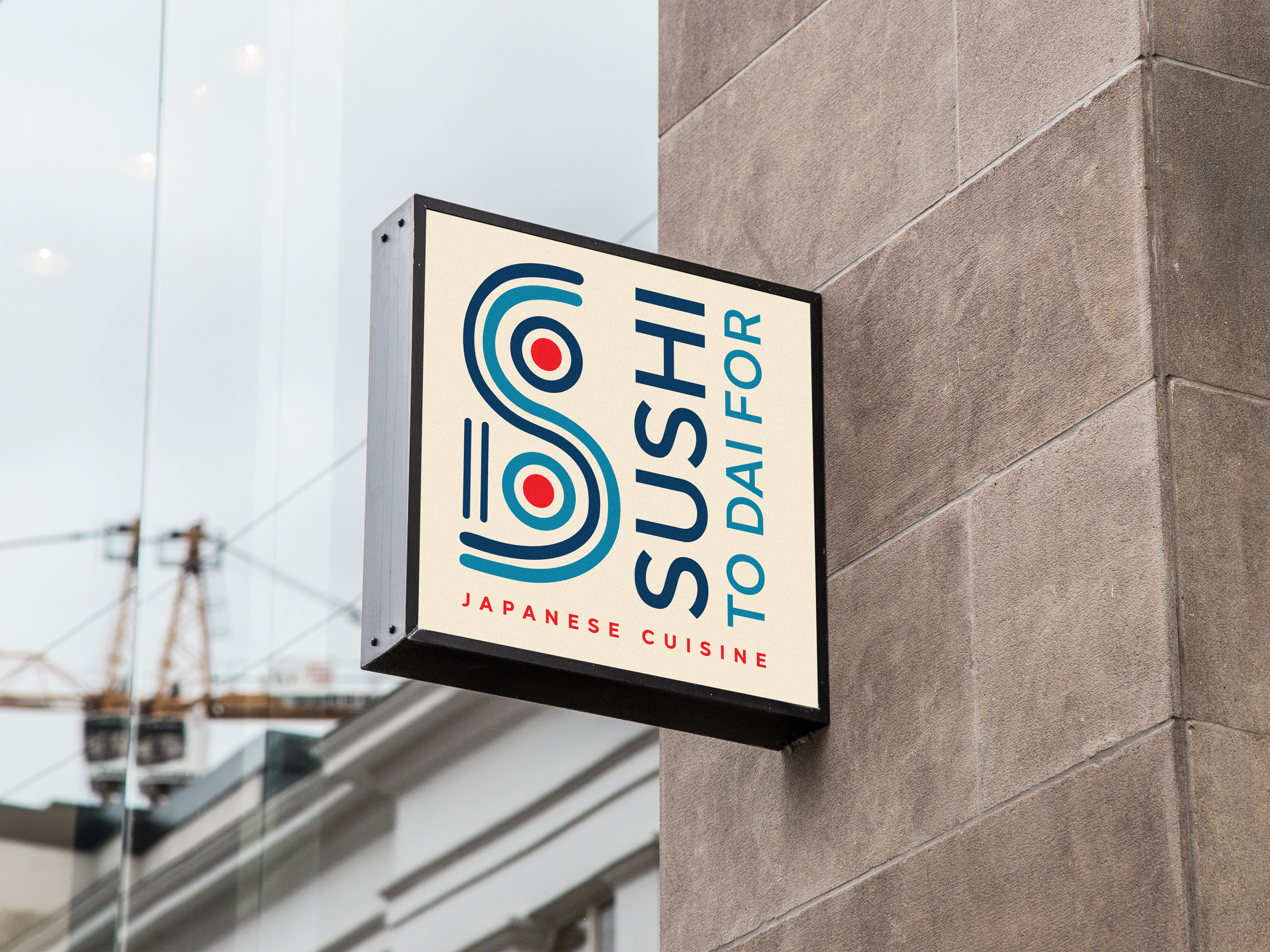
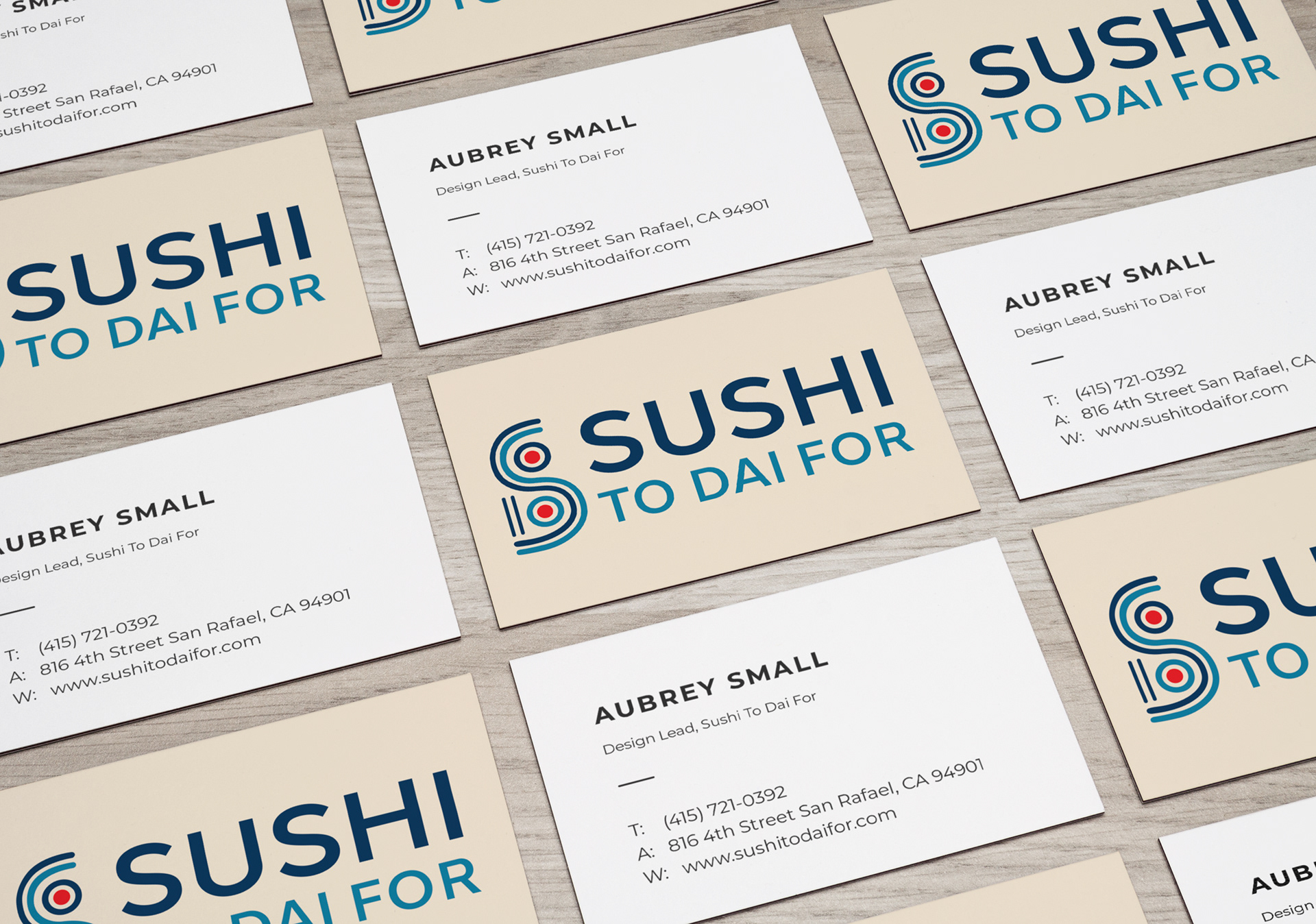
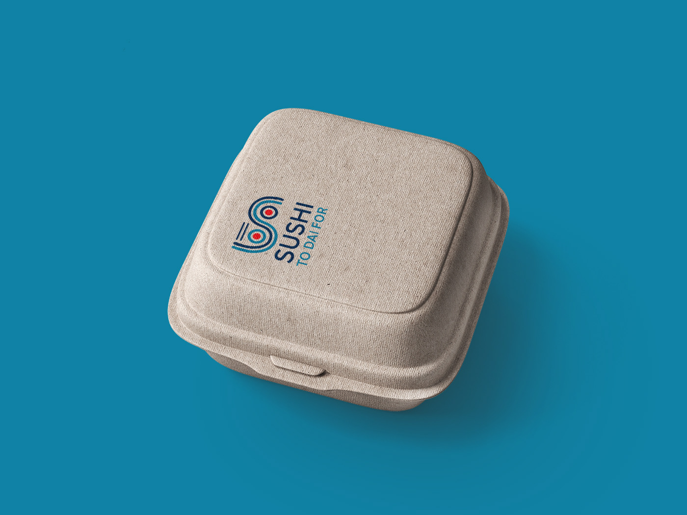
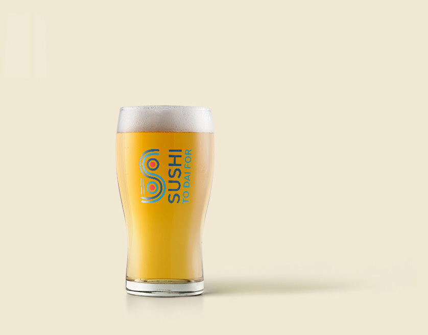
I ended adding a neutral color to the background to give it a natural look and feel. Oceanic blues and a firey red to represent the pun in "Dai."

